
There was a time when opening a new web project felt a bit like opening a box of Lego sets where every brick was exactly the same size. You knew the drill. You had your header, your three-column feature row, and your tidy little footer. It worked, it was clean, and it was incredibly boring. We spent years obsessed with order, terrified that a single pixel out of place would break the internet. But things are shifting. People are tired of looking at websites that look like digital filing cabinets. They want something that feels alive, something that has a bit of soul and movement. Moving toward organic, anti-grid layouts is about reclaiming that personality. It involves taking the tools we have used for years and finally letting them get a little messy. This shift represents a move toward a web that feels more like a printed magazine or an art gallery and less like a spreadsheet.
Historical Context: The Era of Rigid Grids
The Bootstrap Look
If you worked in design between 2011 and 2020, you know the shadow that frameworks like Bootstrap cast over the web. These tools were a godsend for developers who needed to make things work on mobile devices quickly. However, they created a visual monoculture. Almost every site followed a 12-column grid. You could practically see the invisible vertical lines holding everything in place. Content was forced into containers that felt more like cages. This era was defined by the hero image, followed by the “three-bucket” layout, followed by a standard contact form. It was efficient, but it lacked the spark of true creativity.
Symmetry and Predictability
We became very comfortable with symmetry. If an image sat on the left, a block of text had to sit on the right to balance the scales. This predictability made the web easy to navigate, but it also made it forgettable. Users started to tune out because they already knew where everything was going to be before the page even finished loading. We valued safety over surprise. The industry prioritised a “perfect” alignment that often ignored the actual emotional impact of the content. Every site felt like it was built by the same robot using the same set of rules.
Efficiency vs. Personality
The trade-off for all that speed and reliability was a massive loss of brand identity. When every website uses the same grid, the only thing distinguishing a bank from a bakery is the colour of the buttons and the stock photos they choose. We reached a point where efficiency was the only metric that mattered. If a design was “clean,” it was considered good. But “clean” often became a synonym for “empty” or “soulless.” We are now seeing a pushback against this. Designers are realising that a bit of friction or a bit of unexpected placement can actually make a brand more memorable. It is about finding a way to be efficient without being anonymous.
The Evergreen Foundation: Structural Integrity
Core Technologies
Even when we are trying to break the grid, we still need a solid foundation to build upon. CSS Grid and Flexbox are the actual engines that allow us to be this rebellious. You cannot effectively break a grid if you do not understand how to build one first. These technologies have matured to a point where they are no longer experimental. They are the bread and butter of the modern front-end. CSS Grid, in particular, is what allows us to place elements in specific coordinate spaces, giving us the power to overlap and offset items with precision. It is the skeleton beneath the skin. Without these tools, trying to create an organic layout would be a nightmare of broken floats and buggy positioning.
Information Hierarchy
No matter how “anti-grid” your design becomes, you still have to tell the user what to look at first. This is where the evergreen skill of hierarchy comes in. If every element on the page is screaming for attention by being in a weird spot, nothing gets noticed. You still need a primary heading. You still need clear navigation. The trick is to wrap these essential pieces in a layout that feels fluid. You can have a headline that is slightly offset or a call-to-action button that sits half-on and half-off an image, but the user still needs to find them instantly. Good design is about guiding the eye, even when the path you are taking is a bit winding.
Responsive Design
One of the biggest fears with organic layouts is that they will fall apart on a smartphone. However, true structural integrity means the design adapts. Responsive design is not a trend, it is a requirement. An anti-grid layout on a desktop might look like a scattered collection of beautiful elements, but on a mobile screen, it might need to tuck back into a more linear flow for the sake of the thumb. The challenge is maintaining that “bespoke” feel even when the screen gets narrow. You have to be intentional about how things stack. It is not about making it perfect on every screen, but about making it feel intentional on every screen.
The Modern Anti-Grid Twist
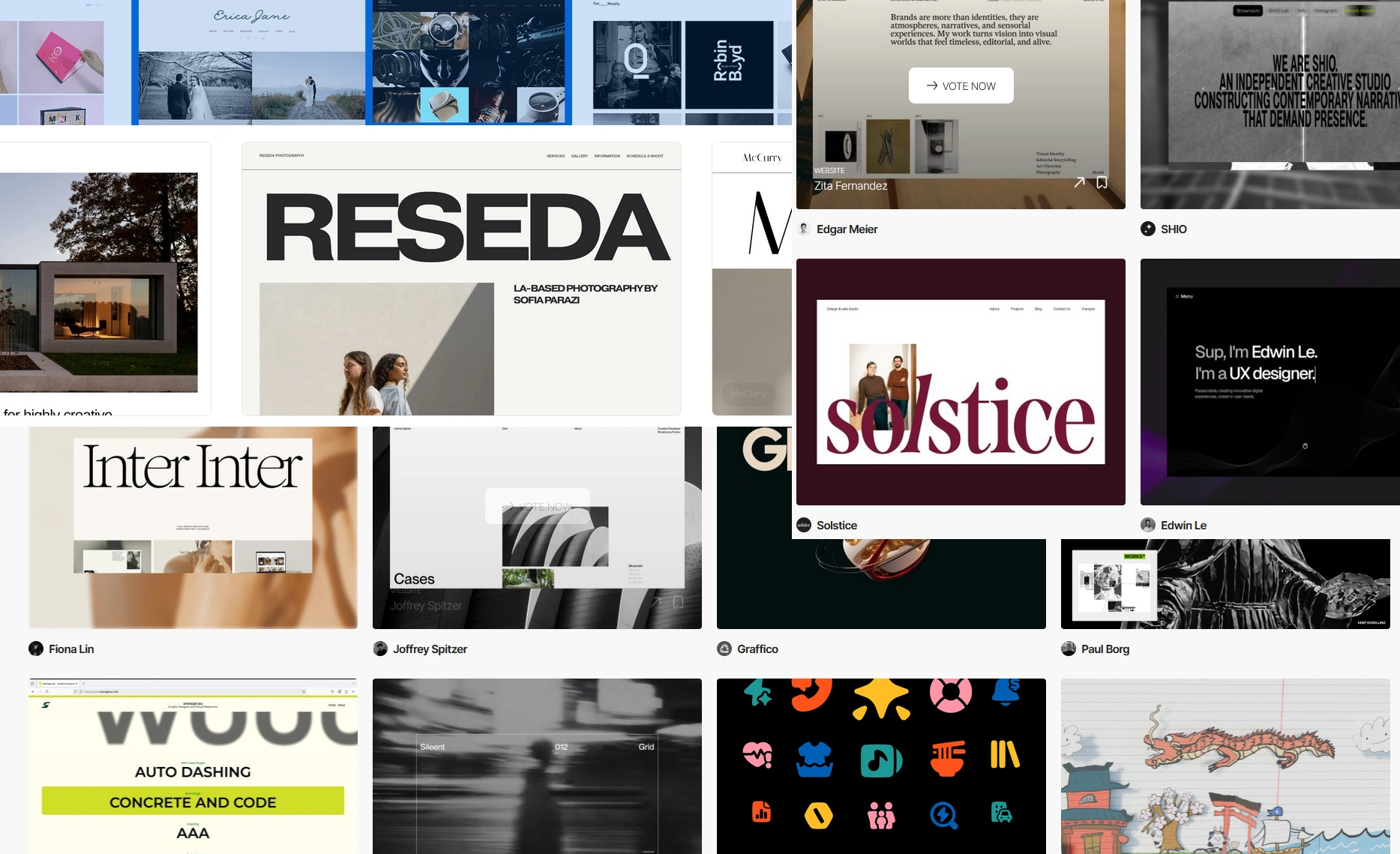
Asymmetrical Compositions
The most immediate way to break the grid is to embrace asymmetry. This does not mean things are unbalanced, it means they are balanced unevenly. Think of it like a seesaw where a small, heavy object on one side balances a large, light object on the other. By moving away from mirror-image layouts, we create a sense of visual tension. This tension keeps the brain engaged. When a layout is perfectly symmetrical, the eye tends to stop moving. When things are slightly “off,” the eye hunts for the rest of the story. It makes the page feel like it has energy and direction.
Layering and Overlapping
In the old days of web design, everything had its own box, and boxes never touched. Now, we are seeing a lot more layering. Text might overlap an image, or a background shape might bleed into the next section. This creates a sense of depth that was missing for a long time. It makes the website feel less like a flat piece of paper and more like a physical space. When elements overlap, they create a relationship between each other. A heading that sits over a photo of a person makes that person feel like they are part of the message, rather than just a decorative element nearby. It is a simple change that adds a lot of visual sophisticatedness.
Organic Geometry
We are finally moving beyond the 90-degree angle. For a long time, every edge on the web was a hard corner. With the help of SVG masks and CSS clip-paths, we can now use “blobs,” waves, and hand-drawn shapes. These organic forms soften the digital experience. They make the screen feel less cold and technical. By using an SVG mask on an image, you can turn a boring rectangular portrait into a soft, fluid shape that flows into the surrounding whitespace. This helps break up the “blocky” feel of a website and makes the whole thing feel more human and less manufactured.
Bespoke User Experience
The goal of all this is to create a bespoke experience. We want the user to feel like the website was crafted specifically for the content it holds, rather than the content being poured into a pre-existing mould. It is about digital storytelling. When a layout reflects the mood of the brand, it builds trust. A high-end fashion brand should not have the same layout as a local plumber. The anti-grid approach allows us to tailor the visual rhythm of the page to match the “voice” of the company. It makes the web a more interesting place to be.
Technical Implementation Methods
Negative Margins
One of the easiest ways to start breaking the grid is by using negative margins. This is an old-school trick that has found new life. By giving an element a negative margin, you can pull it out of its natural flow and force it to sit on top of something else. It is a bit like nudging a physical object on a table so it hangs off the edge. You have to be careful with this, though. If you overdo it without testing, you can end up with text that is impossible to read or buttons that cannot be clicked. It is a tool for subtle adjustments that make a big impact on the overall feel of the page.
CSS Shapes
If you want to get really fancy, you can use CSS Shapes to wrap text around non-rectangular paths. Imagine a circular image of a planet where the paragraph of text actually curves around the edge of the globe. This is a massive departure from the standard block of text we are all used to. It mimics the kind of high-level layout work you see in print magazines. It is still relatively rare to see this on the web, which means that when you do use it, it immediately stands out. It shows a level of craft that goes beyond just “getting the job done.”
Z-index Management
Since we are overlapping so many elements now, z-index has become more important than ever. We have to think about the “stacking order” of our layers. Which element should be on top? Should the text be tucked behind a floating leaf or should it sit proudly in front? Managing these layers requires a bit of a mental shift. You are no longer just building a 2D layout, you are building a 3D sandwich of content. Using z-index strategically allows you to create a sense of parallax or depth as the user scrolls, making the whole experience feel much more immersive.
Embracing the Imperfection
The move toward organic, anti-grid layouts is really a move toward being more honest about design. The web is a messy, fluid medium, and trying to force it into perfect boxes was always a bit of a lost cause. When we embrace asymmetry, overlapping elements, and fluid shapes, we are acknowledging that a website can be both functional and beautiful. It does not have to be a choice between a site that works and a site that looks good. By using the core technologies of CSS Grid and Flexbox in creative ways, we can build experiences that are as unique as the people using them.
It takes a bit more effort to design this way. You have to think more about how things will break, how the hierarchy will shift, and how the user will feel as they move down the page. But the result is worth it. We are finally seeing a web that looks like it was made by humans for humans. If you are feeling stuck in a rut of building the same three-column layout over and over, try nudging an image a few pixels out of its box. Try overlapping a heading. Try using a shape that isn’t a square. You might be suprised at how much life it brings to your work. The grid is a great place to start, but it is an even better place to leave behind.
Peter Dio is the founder and principal of DioP Design, a boutique web design and digital solutions practice established in 2004. With nearly two decades of experience, Peter transitioned from an eight-year career in telecommunications retail to pursue his passion for photography and graphic design, ultimately building a full-service web design business. His background in retail operations provides practical insight into client needs, timelines, and commercial realities, enabling him to deliver bespoke digital solutions that balance creative vision with functional performance.
Operating as an independent practitioner, Peter maintains direct involvement in every project from initial consultation through to deployment. This streamlined approach eliminates the overhead costs and inefficiencies of larger agencies, allowing him to offer professional-grade services at approximately half the industry standard rate. His client portfolio spans small enterprises, professional services, and creative practitioners, with long-term relationships built on reliability, transparency, and consistent delivery. Peter continues to incorporate his photography work into client projects and remains committed to ongoing development in emerging web technologies and design trends.